Introducing: Appalachia Digital Accelerator broadband maps
Custom maps offer rich data to assist communities with broadband planning

Communities participating in the Appalachia Digital Accelerator program were provided custom maps offering a rich view of their geographies with data on everything from demographics, state of connectivity, business demand, middle mile fiber, foliage and topography, and more.
Now, Connect Humanity has published open versions of these maps with the non-proprietary data that we’re able to share publicly.
Maps are available for Georgia, Kentucky, Maryland, Mississippi, New York, North Carolina, Ohio, Pennsylvania, South Carolina, Tennessee, Virginia, West Virginia. Some data covers Appalachian counties only, other data is available for the entire state.
Explore the maps and read on for insights on what they include and how to use them.
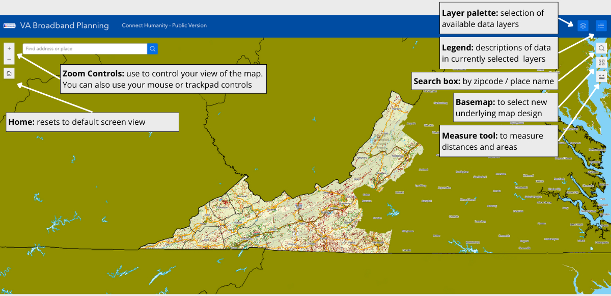
Navigating the interface
Available data
The default is set to show boundaries and FCC data layers. Available data layers include:
| Layer | Description |
|---|---|
| Boundaries | A collection of layers to show various political and economic areas, such as county lines, census boundaries, electric utility territories, wilderness areas, national parks, and national forests. |
| Verticle Structures | Antenna structures, including cellular towers, based on the FCC’s Antenna Registration System and Homeland Infrastructure Foundation-Level Data. |
| Transportation | Road and rail networks |
| Broadband grant awards | Locations of federal / state broadband grant awards. Depending on the source, the data might be polygons or individual location points. Note, some state broadband offices have not yet shared locations with the public. |
| Speed test ratings | Identifies the average up/down speed rating for locations with at least one consumer-initiated Ookla speed test result. |
| FCC Broadband Coverage Maps | Shows coverage claims as reported to the FCC for 1) Wired Only and 2) Wired and Fixed Wireless. |
| Demographic and Economic Data | Survey data showing internet access, technology use, and poverty levels. |
Using the map
Data layers can be turned on and off to help visualize broadband coverage, existing infrastructure, federal and state awards, and more.
Selecting layers: The layer palette shows available data layers. Click down arrows to see nested sub-layers. To display data, check the corresponding box. Unchecking a layer category will also hide any checked sublayers.
Adjusting layer transparency: to allow greater visibility items under a layer, choose the three dots next to the layer or group you want to adjust and increase or decrease transparency.
Moving layers: Depending on the order of layers, one may block another. To change the order, drag and drop layers using the toggle to the right of the layer.
Viewing the legend: When you have data layers selected, the legend will display explainers of the data currently represented on the map.
Measuring areas: The measure tool lets you quickly measure distances and areas. Select the tool and click to draw a series of dots representing the distance/area you want to measure. Press enter to finalize your measurement.
Other tips
Preferred Browser: We suggest using Firefox or Chrome. Safari and Edge also are supported.
Internet Speeds: Some layers contain large amounts of data that may be slow to load if you are on a low capacity internet connection.
Resetting map to defaults: If you want to reset the map and layers, refresh your browser.
Troubleshooting: If selected layers are not showing, check the transparency and order of layers. If you still don’t see the desired layer, refresh your browser.
Example use cases
FCC Vs Ookla Data
Suggestion: Try overlaying the Speed Test layer with an FCC Data claimed speeds layer.
Why? By contrasting Ookla speed tests with ISP-reported speeds, you may reveal areas where providers are overstating coverage. If a part of the FCC map is green but there are only red and orange Ookla locations in that same area, then that area may be worth investigating.


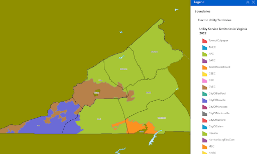
Electric Utility Boundaries
Suggestion: Turn on electric utility boundaries to see which provider(s) operate where.
Why? Rural electric cooperatives can be great partners. Some co-ops have entered the broadband business others can be great partners from deployments. And for any project using aerial fiber you’ll need to know who owns the area’s existing utility poles.
Experiencing technical difficulties or have questions? Email sarah@connecthumanity.fund.
With thanks to Reid Consulting, technical partner on the Accelerator, for creating these maps.
The Appalachia Digital Accelerator is a project in partnership with the Appalachian Regional Commission (ARC), which contributed $6.3 million (80% of the total project cost).
Keep in touch
To learn more about our work follow us on social media, subscribe to our newsletter, and write to us anytime at info@connecthumanity.fund.